*Disclaimer: This post contains affiliate links from which I may receive a commission at no cost to you*
Hello everyone, today I want to talk to you a little bit about Nozbe, which is this really cool program that I came across a few months ago. Unbeknownst to us, they had actually been around for a while, but I signed right up, as I'm very interested in the latest and greatest to-do lists, organizers, things like that. This looked like a really cool app. I like that they had, as it says here, apps available for Mac, Windows, Linux – which is nice, Android, iPad, iPhone. That’s a pretty robust ecosystem they’ve got right there. Then I had some screen shots online, things like that, decided to check it out. I really like it. It looks like a very clean interface and simple to use. I believe they just updated with some of the wearables, so that’s interesting if you’re into that. Not sure how usable that is, but it’s another way to capture information which is kind of nice.
Note: If you’re interested in Nozbe after seeing the review, click here to be taken to their main page.
What I’m going to do next is hop into the Web-based app and go from there. Here we are, this in the inbox. This is going to go through the setup of the Web app. Obviously the mobile apps operate roughly the same way, a little bit smaller screen, but the setup is the same which is really nice. It’s pretty cohesive an experience with the Nozbe app.
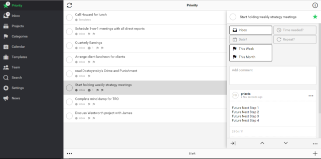
You got Priority, Inbox, Projects, Categories and Calendar. These are the big ones you’re going to use. Then in your inbox you have exactly what you think. Down here you have a + button if you want to put something in like “Record Nozbe video,” and then save it. Real quick, that’s what you see right here, and it’s to get this stuff captured very quickly. You can make it a priority take by clicking on the star, and you can see it now popped up that I have 1 priority task. If you want to remove that, it’s easy.
If you click on the main body, this is how you can edit. Over here in the little side panel that pops up you can also click on this Project Info to get activity, attachments. This is pretty cool, you can attach just about anything you want, depending on how you set it up. I guess I should … we’ll go over that in a little bit more detail, but there’s integrations with things like Dropbox which are really powerful.
Then if we go back … I’m going to shut this little Info tab. You can, again this toggles Priority or not. You can give it a category. Time Needed, this is handy feature that I haven’t seen on any other applications. You can give each task as you do it a time needed as an estimate, and that way you can see what your to-do list looks like in terms of total time needed. To give you an idea about this you can say … I’ve got a list here of handy times, and we’ll say record the video’s going to take 45 minerals. You now can see in the inbox there’s just the one that I’ve made, but one left, at a total of 45 minutes. If we add another one here it gives you a running tally, which is pretty neat.
Date, you can give yourself a date and time reminder. Then you can set up repeating tasks. The last couple that are pretty standard, you need to have dates and repeating. I would want that on any app. This time assignment is pretty cool. Then being able to do the categories and priority is also very handy. Then obviously you can delete your task if you want to.
We’re going to keep this, go ahead and hide the task details, and set one more up real quick so I can show you that time feature. We’re going to say, “Post the video.” Save that. We’re going to go in and we’re going to edit that, and we’re going to give it we’ll say 15 minutes. You can now see that there’s 2 tasks and now the total’s up to 60 minutes. We’ll put the date for tomorrow the 22nd, set date. Now it’s got a date assigned to it. You can see here it says tomorrow.
You have projects and categories. If you want to set up a project, again very simple, you use the + feature down here, and we’ll call this Views. We’ll save that. I could go in here and you could have a project now with reviews, or maybe you’re with a certain business project or something you’re working on at home. This is very handy. So you’ve got your projects, and then you’ve got categories. Over here we could add a category. We’ll call this Video Work. That’s a little bit different than a project; this is a category of things. I can add … Over here I could tag this, say well what category? Video Work. Do the same thing with this one, confirm. Now when we go in here, this is handy when we look at it. We’ve got these hall clustered together. Then if you want to look at the calendar, it’ll show you when you have things assigned. Again, very handy feature.
Overall, this is a very good app. I like the way it’s put together. I’ve been using it for a little bit now. It’s very simple to use, the work flow’s good. I think that maybe the only downside for some people is that it has a lot of features. I think it’s kind of a power user scenario where if you’re really going to be managing a lot of projects, you’ve got some in-depth lists, things like that, or maybe even you’re working with a team – it does have a team feature that I’m not going to go into here but if you’re interested you can check it out.
For a basic user it may be a little bit too much, but I advise checking it out. It’s a very solid app. Again, it’s available on all the major platforms. Well worth a few minutes of your time to go and see if this is a good fit for you. Hopefully this helps you out.
If you are interested in trying out Nozbe, check it out here: Nozbe main site.
Thanks and feel free to leave a comment below!


IF there is anything that can make me productive, I’ll take it. Some days, I’m a lazy bum. 🙂 Help me, Nozbe.
Thanks for all the info about Nozbe. I’ve been looking at it for a bit. Hopefully it’ll get me to where I need to be right now.