Seeking to improve your productivity and speed up your team, ClickUp is an inexpensive option for those obsessed with efficiency.
*Note: This post contains affiliate links from which I may receive a commission at no cost to you.*
Back again to obsess over productivity apps – ClickUp, is a project management tool seeking to knock the frustration out of PM. It’s getting some good reviews, so I gave it a try for a week by setting up my current job search as a project and getting a feel for the app. And as you’ve read in my other reviews, we will address features and design.
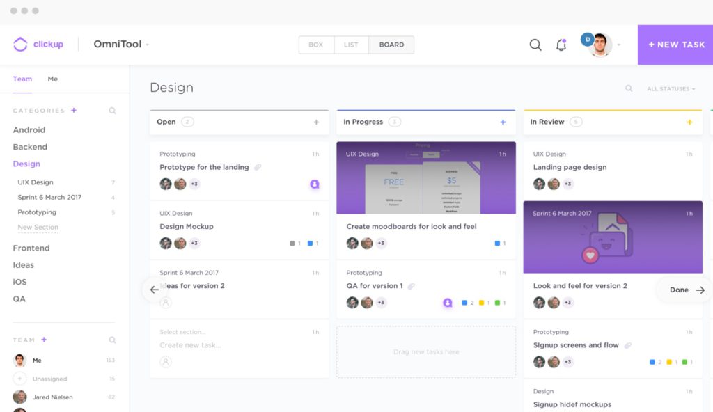
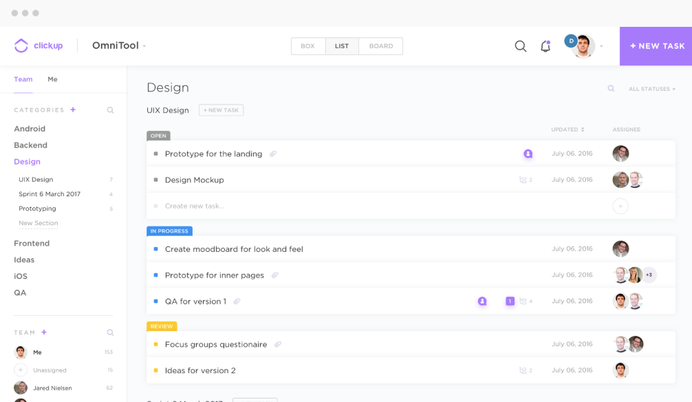
On the feature front, ClickUp offers a pretty standard set up of tools for a productivity app. What stands out first and foremost are the status options. In general, most productivity statuses are simple: not started, started, in progress, done, etc.
But ClickUp lets you set up custom statuses that match your workflow.
For example, if you’re doing instructional design projects, you may assign projects based on where they are flowing in an ADDIE model, or if you are a Realtor, you may have things cataloged by sold, in negotiation, etc.
Customization is king and custom status is the closest you get to building your own app. And if you like it simple, you don’t have to customize it. The assigned comments feature lets you follow up on specific comments that originate action items – which is useful in team collaborations.
You can also assign changes to multiple tasks at once, including changing statuses (I would bulk assign completion tasks when I finished applications that I did in batches). There a lot of features here, but the best feature is how the app allows you to toggle on and off features that you will or won’t use – once again, customization is front and center for this platform.
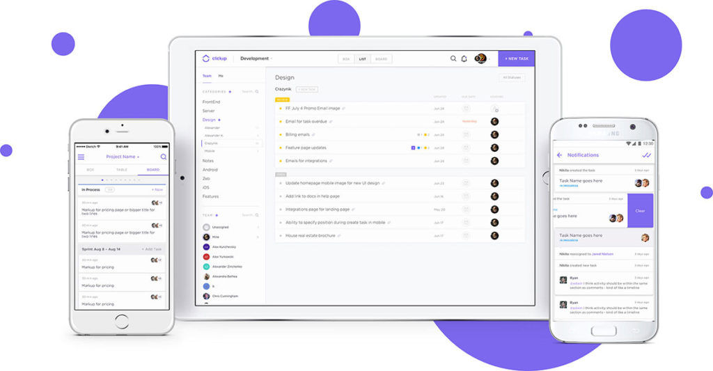
In terms of design and intuive use, ClickUp nailed it.
It’s super easy to use, and the concept of space is pretty standard in design thinking. If your organization uses Agile methodology, this app is ready for you.
In terms of view, you can declutter the features, but the three viewing modes (list, box, and board) can help you filter the information and make decisions quickly depending on what role you have on a board or project. There is also a “Me” board that removes all the clutter and focuses on your tasks – a great way to do focused productivity bursts. ClickUp describes itself as beautifully intuitive, and I can’t disagree – both the web app and mobile app are insanely easy to use.
No complaints here.
And the horizon looks good for ClickUp – with new features like image markup, Gannt charts, and threaded comments for starts.
This application is great, and it’s got a lot of growth coming up to an already rich feature base. It’s free with 100MB of storage, but the $5 fee for team member per month that includes team onboarding and set up (say you’re switching from another platform) and Dropbox/Google Docs integration? That’s a bargain, Charlie.
ClickUp is on the way up and it’s got it all – features, a beautifully accessible UI, relentless customization, and lot of new and upcoming features. If you’re into the productivity platform and you’re looking for a new solution for your team, go check it out.


I have a chance to explore other apps and they are junk, but ClickUp looks so perfect for me and my husband. Me likey. MZ